TRIANGLE
Branding incl:
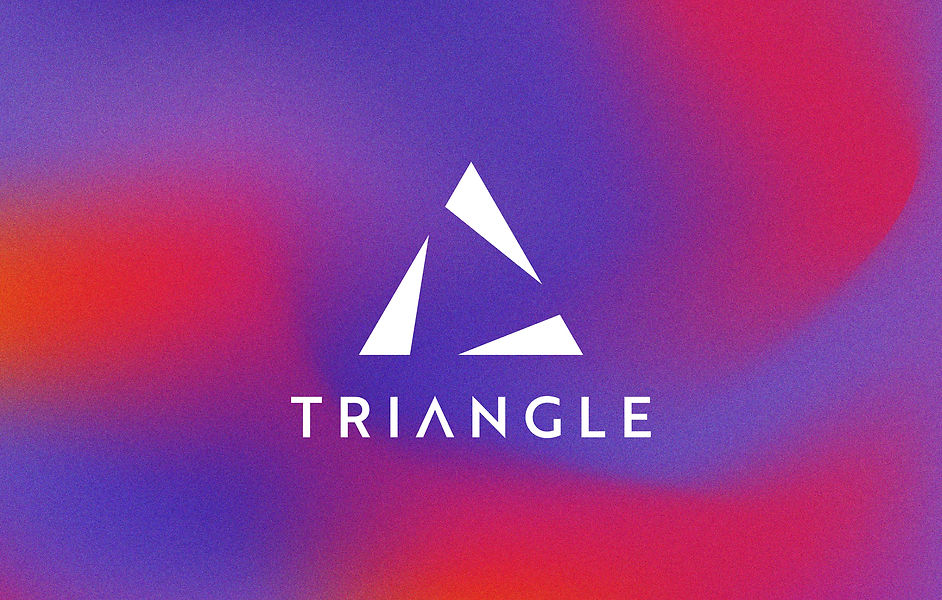
Primary Logo
Secondary Logo
Submark Logo
Business Card
CLIENT OVERVIEW
Triangle is a branding agency that specialises in tailored 1:1 private consulting, helping businesses build strong and impactful brand identities. They required a logo suite that reflected their expertise, while maintaining a modern and minimalist aesthetic.
THE CHALLENGE
The goal was to design a brand identity that captured the essence of Triangle while ensuring it remained unique, sleek, and professional. The challenge was to incorporate the triangular element without making it overly generic or predictable. Additionally, the brand needed a bold yet balanced colour palette to differentiate it within the competitive branding industry.
THE SOLUTION
To achieve this, I developed a three-part branding suite, consisting of a primary logo, secondary logo, and a submark:
-
Logo Concept & Execution: The primary logo was designed by deconstructing a triangle into three distinct parts, symbolising strategy, creativity, and execution—the core pillars of the agency’s consulting services. This approach maintained simplicity while adding depth and meaning to the design.
-
Sketching & Digital Process: The design process began with hand-drawn sketches, allowing for creative exploration before moving into Illustrator to refine and execute the final logo.
-
Colour Palette: A vibrant blend of purple and hot pink was chosen to create a dynamic and contemporary visual identity. These colours convey creativity, innovation, and energy, aligning perfectly with Triangle’s brand values.
-
Brand Collateral: In addition to the logo suite, we provided Triangle with business cards that maintained the brand’s signature colours, ensuring consistency across all touchpoints.
THE OUTCOME
The final branding solution successfully delivered a professional yet creative identity for Triangle. The simple yet impactful triangular design set the agency apart, while the colour scheme added a fresh and modern appeal. The client was extremely satisfied, and the brand identity has since been effectively implemented across various digital and print platforms.
CONCLUSION
This project highlights the power of thoughtful branding, where minimalism meets meaning. By carefully breaking down a fundamental shape and reinforcing it with strategic colour choices, Triangle now boasts a brand identity that is both timeless and distinctive in the consulting industry.